
What Actually Matters When Building a Longevity Dashboard for Your Practice
A longevity dashboard should do more than display health or performance data. For clinicians and longevity professionals, its real value comes from bringing historical data from wearables, biomarkers and lab records into one unified view that makes patterns easier to identify and insights easier to act on.
The most useful platforms prioritize longitudinal trends over isolated measurements. They show how each client is changing relative to their own baseline and fire notifications when a deviation is detected. At the practice level, cohort views can help clinicians identify where to best allocate their time. An AI layer can make both individual and population health easier to explore by allowing practitioners to query the entire data pool instead of manually combing through siloed databases.
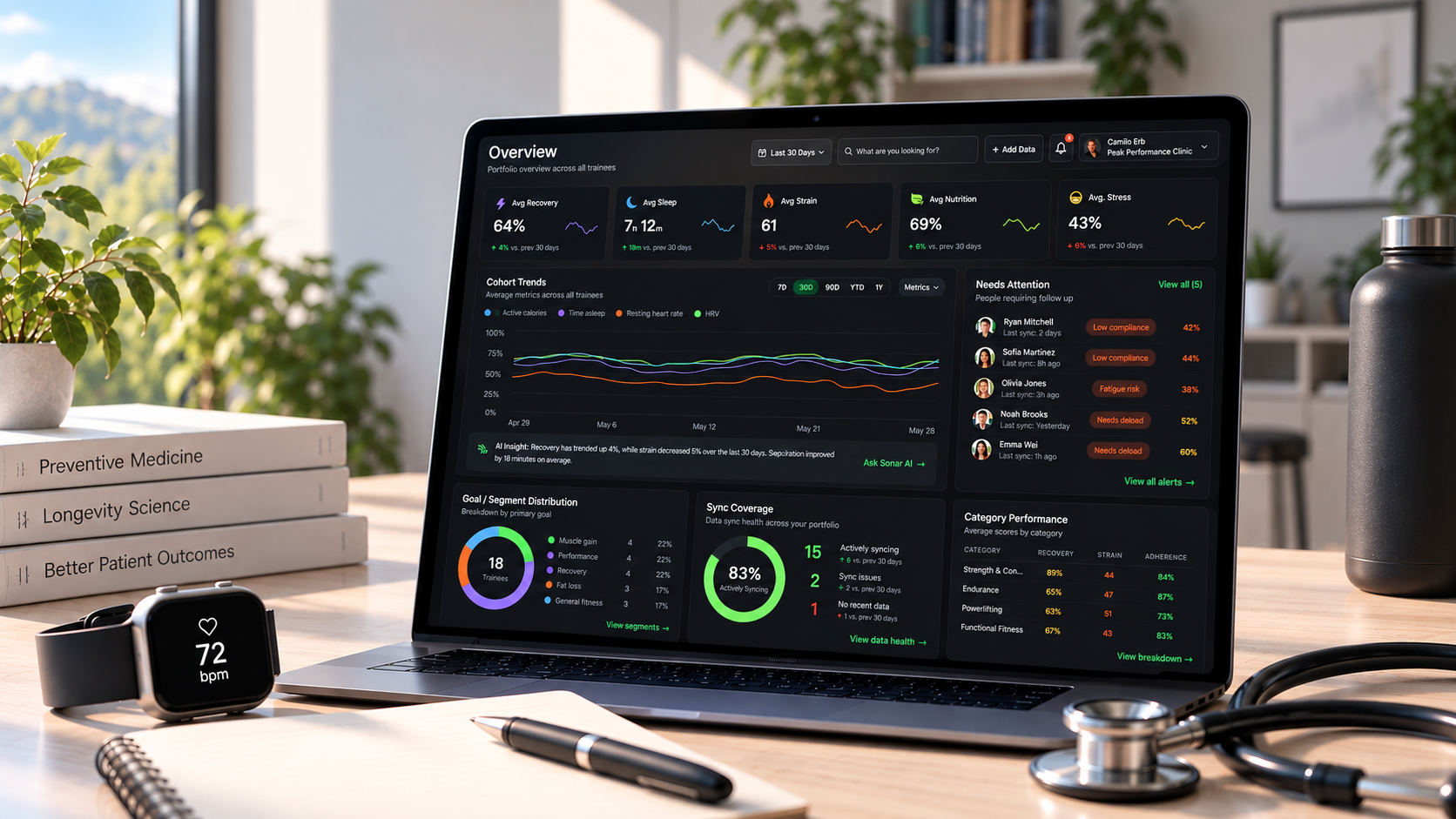
What should a longevity dashboard include?
The best structure starts with the questions a clinician needs answered. What changed? Is the change meaningful? How long has it persisted? What else changed at the same time? Does this client need follow-up?
That means organizing information around clinical context rather than placing every available metric on one screen.
| Dashboard area | What to show | Why it adds value |
|---|---|---|
| Client overview | Current status, recent changes and active goals | Gives the practitioner immediate context |
| Sleep and recovery | Sleep duration, consistency, HRV and resting heart rate | Helps identify changes in recovery patterns |
| Activity and fitness | Steps, training volume, cardio activity and fitness trends | Shows movement patterns and response to exercise |
| Metabolic health | Glucose trends, weight and relevant laboratory markers | Adds context around metabolic interventions |
| Biomarkers | Labs with reference ranges plus historical values | Makes direction of change visible |
| Interventions | Medication, supplements, nutrition or training changes | Connects actions with subsequent outcomes |
| Data quality | Device source, sync status, deduplication and missing data | Prevents decisions based on incomplete records |
| Alerts | Meaningful deviations from personalized baselines | Directs attention toward clients who may need review |
Design around trends, not snapshots
Longevity care is inherently longitudinal. A single night of poor sleep or one low HRV reading could mean nothing without context.
Large scale research illustrates why long term data matters. A 2026 NIH-led analysis examined approximately 11 million days of wearable data from 29,351 participants. In that dataset, longer measurement windows produced stronger and more stable associations with health outcomes vs. single day measurements. One year step count was associated with 373 prevalent outcomes and 37 incident outcomes after statistical correction, compared with 231 and 17 respectively when researchers used a one day window.
For dashboard design, that argues for making 30-day, 90-day and longer trends easy to inspect rather than emphasizing today's number.
Personal baselines must be addressed too. Resting heart rate and heart rate variability (HRV) vary substantially between people. Therefore, comparing an individual against their own established range can be more fruitful than simply comparing every client against one population target.
Put multimodal data on the same timeline
A longevity dashboard becomes much more useful when different types of data can be viewed in unison.
Let's say a clinician notices that a client's resting heart rate has increased over a three week period. On its own, the observation has limited context. A unified timeline could show that sleep duration declined during the same period, activity volume increased and a new intervention began shortly before the change.
This is the difference between storing health information and creating usable health analytics.
The NIH All of Us program illustrates why this matters at scale. Its wearable dataset includes Fitbit data from more than 59,000 participants across 14 years, with more than 39 million step observations and 31 million sleep observations. Nearly 46% of participants with Fitbit data also contributed other forms of health information through sources like electronic health records or physical measurements.
That combination is important because wearable signals become more informative when they can be interpreted alongside other longitudinal health data. The same principle applies at the practice level. A longevity dashboard should help clinicians connect changes in wearable metrics with shifts in biomarkers or interventions rather than forcing them to review each data source in isolation.
Build a practice-level dashboard, not just individual profiles
A clinician with 200 clients cannot manually inspect 200 profiles every morning.
The practice-level dashboard should therefore work as a prioritization layer. Instead of showing every metric for every client, it should answer questions such as which clients have developed meaningful deviations from baseline, whose data has stopped syncing and which interventions appear to be producing measurable changes.
This approach allows clinicians to move from cohort to individual. They can identify the five people who need attention today, then open the relevant client profile for deeper review.
This is one reason modern health analytics platforms for clinics are moving beyond simple data visualization toward trend detection and population-level monitoring.
Add an AI layer for querying clients and cohorts
Once a dashboard contains months or years of multimodal data, navigation itself becomes a problem. AI can act as an interface between the clinician and that data.
At the individual level, a clinician might ask: "What changed in this client's sleep and recovery during the eight weeks after their intervention?" The system could summarize relevant changes, produce client facing charts and link back to the source data for review.
At the cohort level, the questions become even more powerful: "Which clients had a sustained increase in resting heart rate during the past 30 days?" or "Which patients improved sleep consistency while also increasing weekly activity?"
This type of interface can reduce the time spent moving between charts. It should not replace clinician judgment. Instead, the AI layer should make evidence easier to retrieve and explain how each answer was derived. Clinicians should also be able to review the underlying data before acting on an insight.
Make data quality visible
More data does not automatically mean better information.
Wearables may contain gaps because a device was removed or failed to sync. Different devices can also calculate similar metrics in different ways. The FDA notes that digital health technologies can create substantial volumes of continuous data, while missing data and measurement variation can affect interpretation.
Data deduplication is another important part of this process. When data enters a platform through multiple integrations, that same measurement may be recorded more than once. For example, this could manifest in a 20 hour sleep session if a client is using multiple devices to record their rest. An intelligently designed dashboard should recognize duplicate records immediately upon retrieval and remedy any anomalies before they distort an analysis.
In short, a professional dashboard should make data freshness and source information visible. It should also show whether the underlying records have been cleaned and reconciled. Clinicians need to be able to distinguish a true physiological change from a data hygiene issue before acting on it.
Use role-based access and appropriate privacy controls
Longevity practices may have physicians, health coaches and other staff working with the same client base. Not every role needs access to every data element.
For organizations subject to HIPAA, access to health data should also be limited by purpose. HHS describes this through the "minimum necessary" principle, which generally requires reasonable efforts to limit certain uses and disclosures of protected health information to what is needed for the intended task.
That makes role-based permissions, secure authentication and clear client assignments important parts of dashboard architecture rather than secondary administrative features.
Ready to put this into practice?
Sonar Atlas brings wearable data, lab records, nutrition information, workouts and biomarkers into one intelligent dashboard. It gives practitioners a clear view of each client while cohort monitoring helps surface where attention may be needed across the practice. AI-powered analysis also makes it easier to explore trends and ask questions without manually digging through every chart.
Frequently Asked Questions (FAQ)
What metrics should a longevity dashboard track?
The exact metrics depend on the practice. Common categories include sleep, HRV, resting heart rate, activity, fitness, metabolic measures and relevant biomarkers. The goal should be to show metrics that inform decisions rather than collect every available measurement.
How often should clinicians review wearable data?
There is no universal schedule. Dashboards can reduce manual review by automatically surfacing significant deviations or clients who meet predefined criteria, allowing clinicians to focus on exceptions instead of reviewing every data point every day.
Should dashboards compare longevity clients with population averages?
Population ranges can provide context, but personalized baselines are often valuable for high-frequency wearable measures. The dashboard should make it possible to see both.
How can AI improve a longevity dashboard?
AI can help practitioners query large datasets using natural language, summarize longitudinal changes and identify clients who meet specific criteria. Its strongest role is reducing the time required to find relevant information while keeping the underlying data available for clinical review.
About Sonar
Your body is talking. Are you listening? Sonar unifies all of your wearables, lifestyle, and biomarker data to unlock personalized insights and detection once reserved for elite athletes and biohackers. Trusted by 250,000+ users across 170+ countries, Sonar helps you cut through the noise across sleep, recovery, stress, activity, and nutrition - so you can focus on what actually matters. Sonar isn't just another health tracker. Launched out of Columbia University in New York, it merges the latest medical, sports and data science with AI engines that continuously surface subtle shifts and patterns across millions of data points, helping you know when to push, when to pause, and where to focus next.
More to Explore
September 18, 2026
August 31, 2026
August 19, 2026
Get the latest from Sonar
Share your email to stay up-to-date with all things Sonar
- English (Canada)
- Bahasa Indonesia
- Bahasa Melayu
- Català
- Čeština
- Dansk
- Deutsch
- English
- English (Australia)
- English (UK)
- Español (España)
- Español (Latinoamérica)
- Español (México)
- Français
- Français (Canada)
- Hrvatski
- Italiano
- Magyar
- Nederlands
- Norsk
- Polski
- Português (Brasil)
- Português (Portugal)
- Română
- Slovenčina
- Slovenščina
- Suomi
- Svenska
- Tiếng Việt
- Türkçe
- Ελληνικά
- Русский
- Українська
- עברית
- العربية
- हिन्दी
- ไทย
- 한국어
- 日本語
- 简体中文
- 繁體中文
EN